I conducted US market research to see which skincare brands and products are popular, and which price ranges they fall into.
By browsing various sources like Google Reviews, Sephora and Ulta, Amazon, and several drugstores,
I got a feel for which brands were dominating in their price brackets, and where there might be space in the market for innovation.
I divided the brands I found into three price brackets: Drugstore / Affordable, where the average product price was under $30,
Mid-Range, with an average product price between $30 and $60,
and Luxury, with an average above $60.
As expected, drugstore brands were most commonly found in the drugstore,
while Mid-Range and Luxury products had an unmoving spot in beauty supply stores like Sephora and Ulta.
There is a much larger consumer base for drugstore brands like CeraVe, Neutrogena, and Byoma,
which I found translated to high brand loyalty, leaving little room for a new brand to break into the market.
However, with the rapidly changing nature of beauty and skincare trends,
there was a lot more room for newer mid-range brands to become household names if they could manage a spot in a beauty store,
like Fenty Beauty, Topicals, and Summer Fridays.
Based on my research, I decided that my brand would aim to fall within the Mid-Range price point
and embrace a minimalist but recognizable packaging philosophy.

I also conducted research on traditional Asian ingredients used in health and skincare.
There are a few Asian and Asian-inspired brands that are readily available in the US,
like Innisfree, COSRX, Sulwhasoo, Peach & Lily, Tatcha, and Laneige,
but the majority of widely-used Asian skincare brands are not sold in US beauty stores.
To proceed with my research, I consulted online marketplaces that specialize in selling Asian beauty products to US customers
like YesStyle, Stylevana, and Olive Young.
I used these sources to identify what ingredients are popular to use in modern Asian skincare,
and I decided to incorporate several into my products.
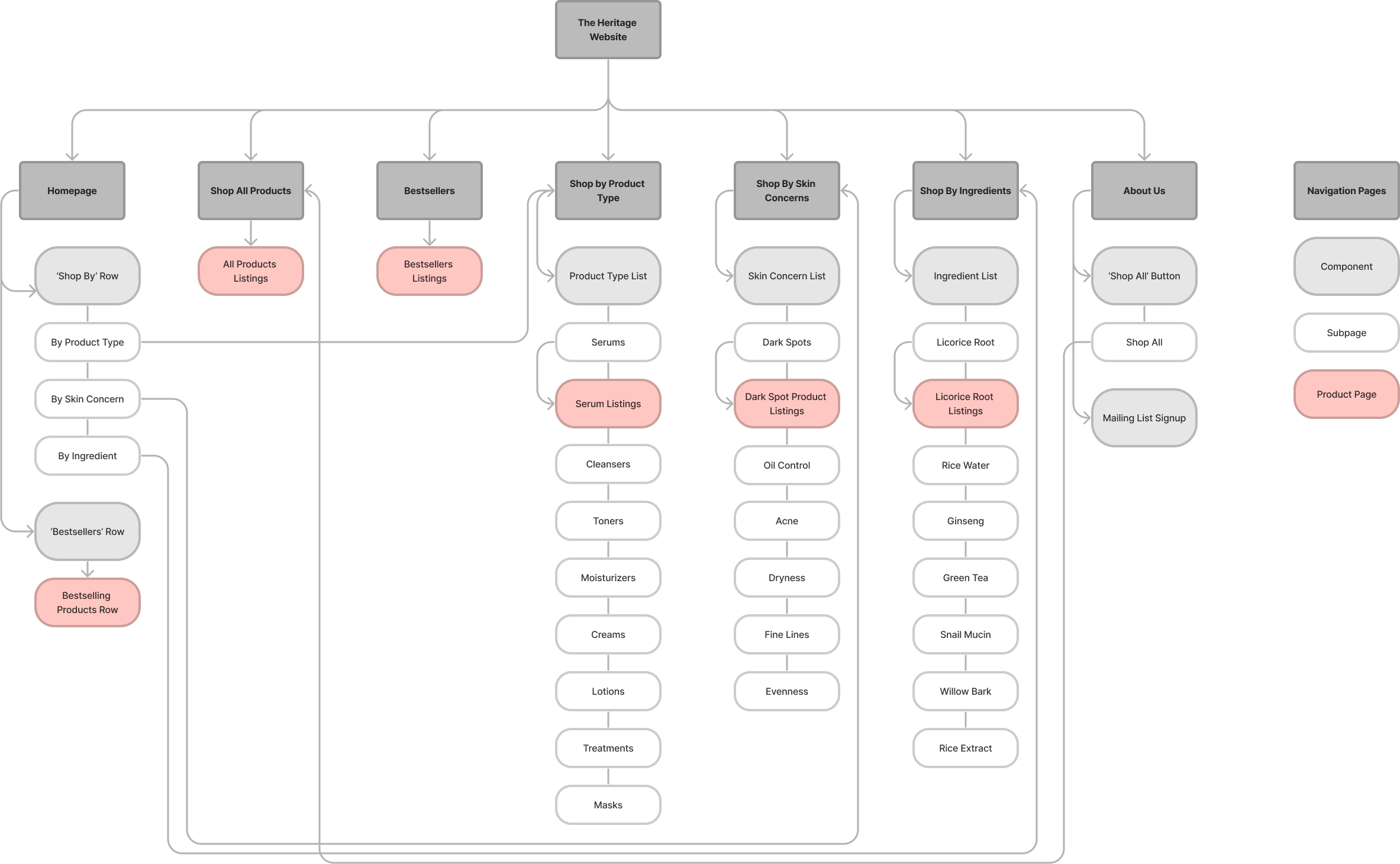
These ingredients include ginseng, green tea, rice, licorice root, snail mucin, willow bark, and Centella asiatica.

After completing my research, I thought of some product lines that would make sense to blend traditional and modern ingredients for a specific purpose:
- Resurfacing Collection: meant to encourage skin cell turnover and promote natural exfoliation.
Best for oily or acne-prone skin and those with acne scars or dark spots.
Potential ingredients to use: retinoids (retinal, retinol, adapalene), licorice root, bakuchiol - Brightening Collection: meant to brighten dark spots or hyperpigmentation to create an even skin tone.
Best for those with acne scars, dark spots, or skin types that are prone to hyperpigmentation.
Potential ingredients to use: rice water, rice extract, ascorbic acid (vitamin C), niacinamide - Balancing Collection: meant to balance the skin's natural environment and improve skin texture.
Best for oily or combination skin to reduce shine and keep the skin looking pristine.
Potential ingredients to use: niacinamide, ginseng - Moisturizing Collection: meant to provide intensive moisture to the skin and reduce the appearance of fine lines.
Best for dry or normal skin and mature skin with fine lines.
Potential ingredients to use: hyaluronic acid, squalane, centella asiatica, snail mucin, green tea extract, ceramides - Exfoliating Collection: meant to gently but powerfully remove sebum buildup from the pores and exfoliate dry and flaking skin.
Best for all skin types, from acne-prone to dry and peeling.
Potential ingredients to use: AHAs (ex. glycolic acid, lactic acid), BHAs (ex. salicylic acid), PHAs, willow bark, fruit enzymes
These ideas will help inspire me as I develop the products in these collections and ensure they cohesively work together. For instance, the Resurfacing Collection could include both a serum for regular use and a more intensive treatment for use as needed.
