Figma
Balsamiq
Jira
Jun - Aug 2023 (3 months)
Before the platform, medical device sales representatives had to rely on fragmented communication and manual systems - spreadsheets, phone calls, and email chains - to order and track products. This process was not only inefficient, but also prone to human error, making it difficult to manage inventory and customer relationships at scale. The challenge was to design an intuitive e-commerce experience tailored to the unique needs of a B2B medical device manufacturer, balancing usability with compliance and scalability.
Currently, sales representatives typically rely on time-consuming manual processes to place and track product orders. To understand the needs of e-commerce software users, I conducted competitive analysis of existing B2B e-commerce platforms and gathered input from the client's internal sales team.
Competing platforms often mirrored B2C shopping experiences, which didn't align with the specialized needs of medical device sales.
Sales reps frequently placed orders on-the-go, yet many platforms weren't optimized for mobile.
Existing tools provided little visibility into customer behavior, leaving sales reps and managers without clear insights.
From these findings, I developed a user persona to represent the primary
audience.
This is Michael, a sales representative for a medical device company. He is often traveling and needs to
place quick, reliable orders while keeping track of customer analytics, but existing sales platforms either
had poor mobile compatibility or didn't provide the detailed information he needs.

Michael has worked in the medical device industry for nearly a decade and
manages relationships with hospitals, surgical centers, and private practices across the
Midwest.
Because he spends much of his week traveling between client sites, Michael often needs to place
orders and check inventory from his phone or tablet in between meetings. He's motivated by
efficiency: the faster he can get products shipped, the sooner his clients can meet their
patients' needs, and the stronger his relationships become.
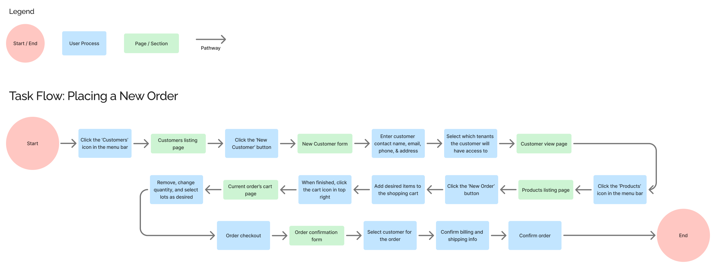
To define the scope of the app and ensure a smooth user experience, I thought through various user needs and
created task and user flows. Since this is a B2B e-commerce platform, a high-value task is placing an order
for a healthcare client, so I decided to dedicate one of my task flows to it.
This is the task flow
for a sales rep to place a new order.
Functions as the digital catalog of the client's inventory. Sales reps can browse, search, or filter products by category, availability, and specifications.
The central hub for sales reps to manage client relationships. From here, users can create new customer profiles, view existing accounts, and access order histories.
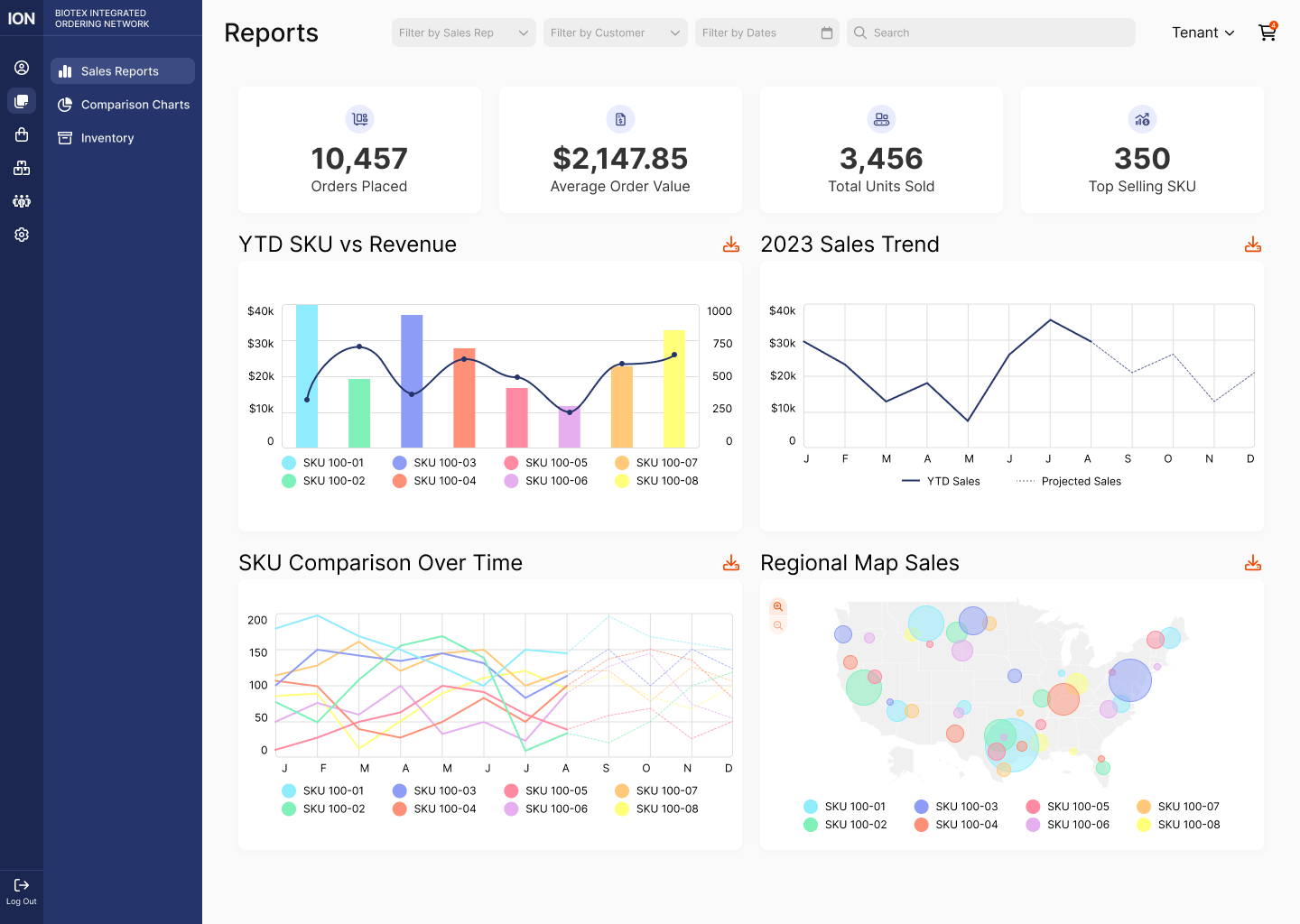
Designed to give users immediate visibility into performance trends, including analytics like total orders placed, revenue generated, and top-selling products.
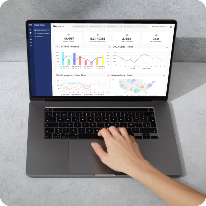
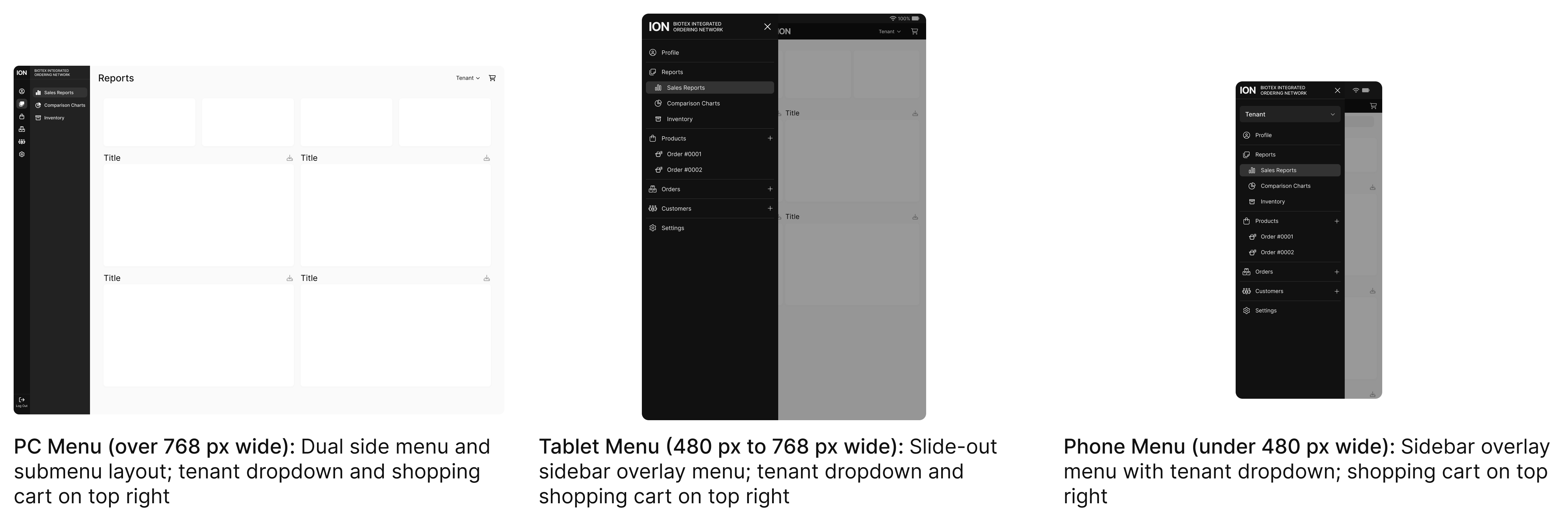
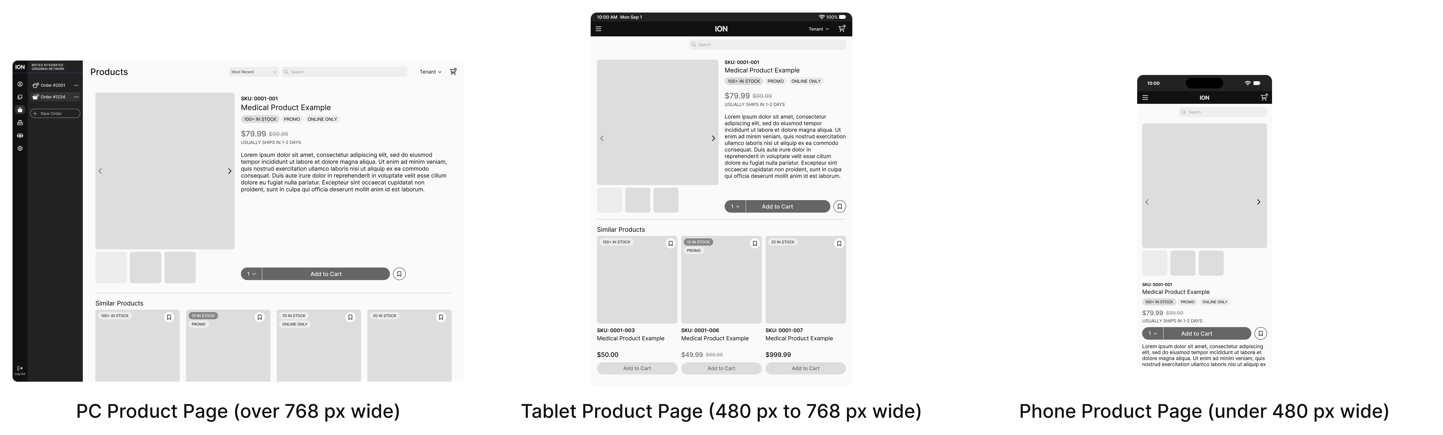
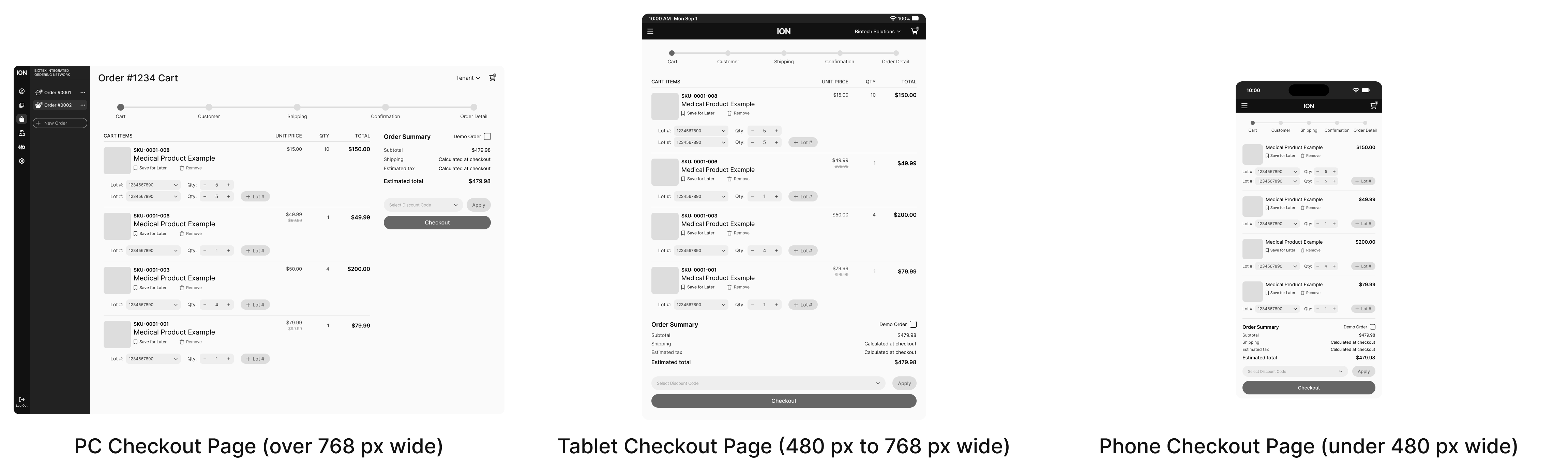
Because sales representatives often work in fast-paced, mobile environments, it was critical to ensure the
platform delivered a consistent experience across all devices. Many reps log in from their office desktops
to manage bulk orders, but they also rely heavily on tablets and smartphones while traveling between
hospitals and private practices.
To address this, I designed mid-fidelity wireframes for desktop,
tablet, and mobile screens. Each version
was carefully adjusted to prioritize clarity, speed, and ease of use:
By approaching the design responsively from the start, I ensured that the platform not only scaled visually but also adapted to the unique contexts in which sales reps use it. The result was a product that felt equally reliable at a desk or on the go. Here are some mid-fi examples of my responsive design work.
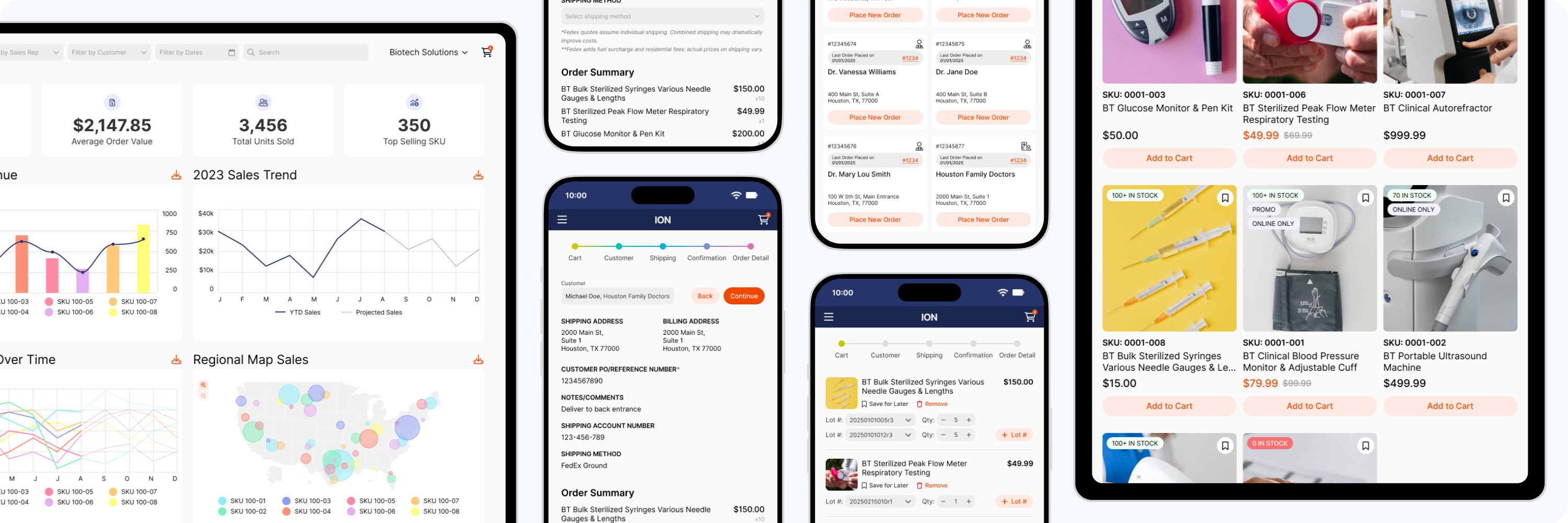
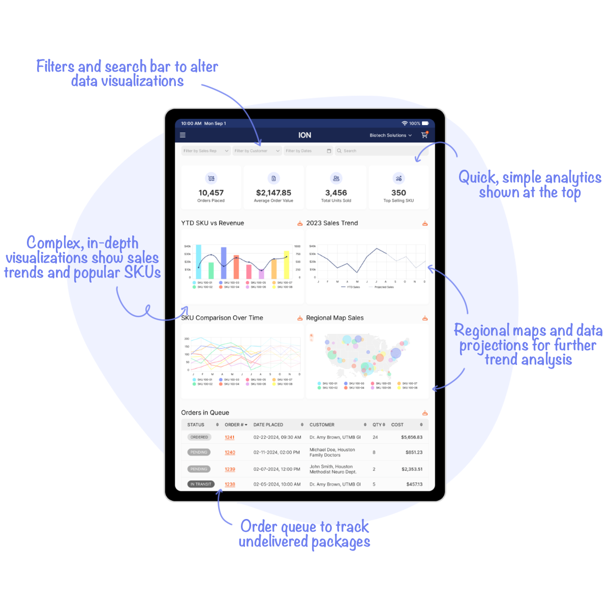
Data doesn't have to be dry. The dashboard pulls together everything a sales rep needs to feel in control - from quick hits like orders placed and top SKUs, to big-picture visuals like year-to-date revenue charts and regional heatmaps. Filters and search bars make the analytics interactive, so reps can zoom in on a single customer or drill down by supplier without breaking stride.
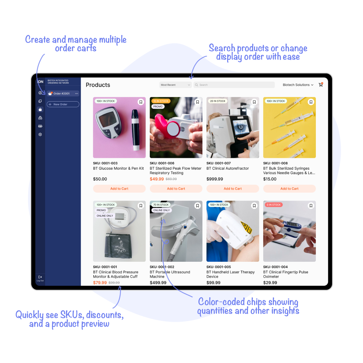
This is a rep's personal marketplace. Products are listed with all the essentials - quantity, pricing, and discounts - while multi-cart functionality keeps things flexible. Reps juggling multiple clients can spin up different carts at once, making it easier to manage busy days without losing track of who ordered what.
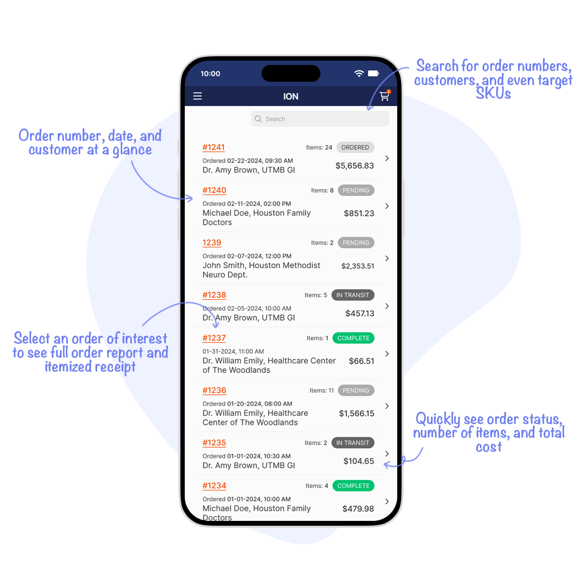
No more digging through email threads to find what shipped when. The order history page neatly logs every order with its status, cost, and delivery details. Clicking into a card opens a full report, down to which lots were pulled and any special delivery notes. And with a quick search bar, reps can track down an order by SKU or customer in seconds.
The platform has been live for two years and continues to drive measurable business results. Since launch:
These outcomes are a clear indicator that the carefully curated and streamlined process of ION is saving time for both sales reps and vendors. They show that great amount of trust has been placed in the system for high-value transactions on a regular basis.
Although the platform is performing well, there are areas I'd love to expand if given the opportunity. AI integrations could allow us to build more predictive sales models and trend visualizations directly into the dashboard to empower reps with forward-looking insights. Additionally, while mobile usability was a core priority, additional features like offline mode or customer message notifications could further support sales reps on the go.
This project was pivotal for me as a junior designer. I gained confidence in
balancing business
objectives with user needs, and learned how small design decisions - like how a product card is
structured or how filters are presented - can significantly impact efficiency at scale.
Working closely with front- and back-end engineers also sharpened my ability to design with
implementation in mind. If I could revisit the project today, I'd push for more iterative usability
testing during the design phase, to validate decisions earlier and fine-tune flows for mobile
users.
Most of all, this project showed me the value of designing tools that make people's work easier.
Seeing sales reps embrace the platform and rely on it daily reinforced why I love UI/UX design: when
done
well, design quietly removes friction so users can focus on what they do best.
Illustration Credit: unDraw
Stock Image Credit: Pexels