Background
FitBit is a popular electronics and fitness company known for its wearable health monitors.
These wearables, which also function as watches, and are worn on the wrists,
connect to an app on the user's phone to allow health monitoring and exercise recording.
However, the FitBit mobile app doesn't currently have a dark mode option.
Dark mode is a display setting that many interfaces have,
which replaces most of an app or website's light or bright colors with darker hues.
Dark mode is preferred by some users because it exposes them to less bright and blue light,
can help alleviate headaches, and is easier to view in low light.
Some users also just prefer the aesthetic of dark mode.
Goals
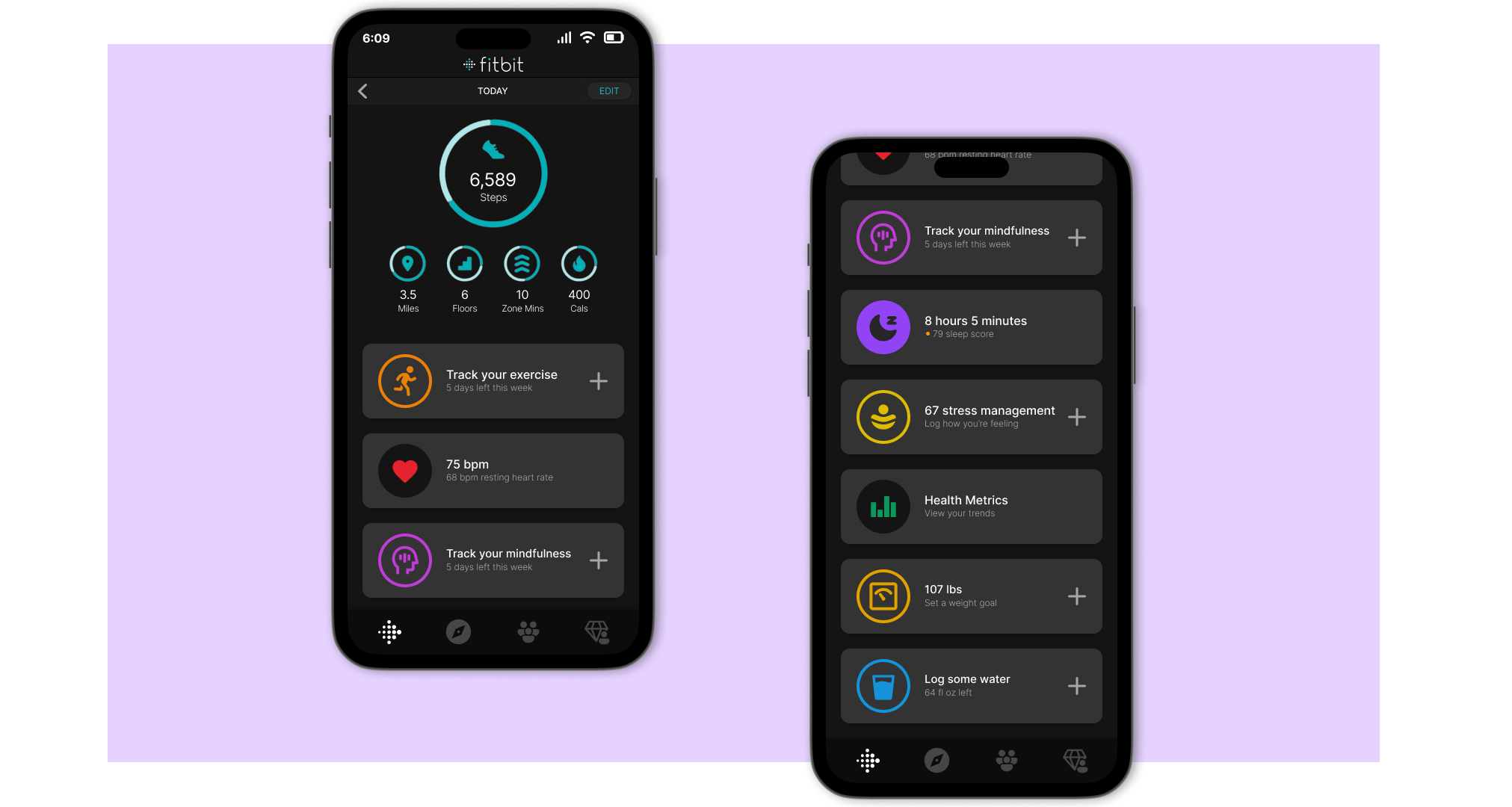
- Create a high-fidelity wireframe that implements dark mode into the FitBit mobile app.
- Maintain current functionality and appearance to maintain a clear brand aesthetic and avoid usage confusion.
Project Description
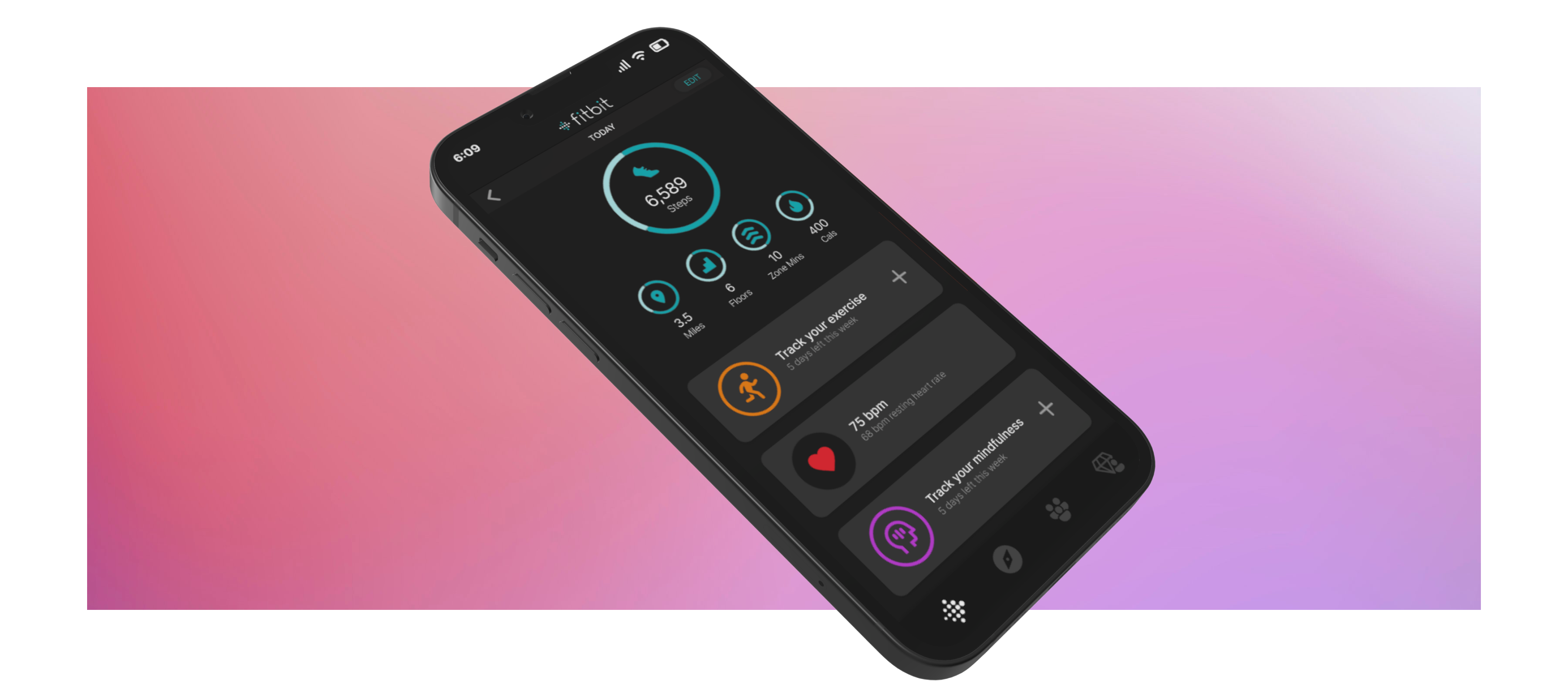
In this wireframe, I recreated the Fitbit mobile app and added a dark mode.
I adjusted the colors to appropriately reflect the hierarchy of the app structure
and decreased the saturation and brightness of the icon colors to fit with the darker buttons.
Overall, I believe my design adequately implements a dark theme for the Fitbit app that would be easily applied to the rest of the app.


